Today, legions of chartists ply their trade with ever fancier charts and (in my opinion) ever more erratic results
I’ll begin this post by noting that I love charts. I began my market journey using charts, and I have noted over the years that technical analysis is a great tool to have in a trader’s or investor’s toolbox. So many times over the years an existing trend kept me patient despite a shorter-term move to the contrary. So many times have breakdowns of technical parameters kept me from catastrophic losses, or holds of said parameters kept me in the game for large profits. In short, I am one of these guys…
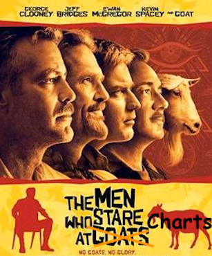
IMPawards.com/Wikipedia
I stare at ’em every day. But as the graphic demonstrates, I also make fun of ’em too. Which means, as a TA, I make fun of myself. Frankly, it’s liberating to get over yourself and have a laugh at yourself. But among the massive market advice community I have noted a tendency for men (and women) who stare at charts and only charts, to have built a mystique among the less sophisticated herds now playing the stock market as if it were a casino (well, okay, you got me there) that their interpretations of the lines, squiggles and shapes carry some kind of meaning beyond what has already happened or what, based on history, may (or may not) happen.
“Golden” or “Death” crosses are the most notorious and dangerous TA hype out there. Here is but one example I’ve uncovered (ahead of time!) over the years. Trend lines are another focus of too many TAs as if a trend line break means much of anything. A better way to go about it is to watch violations of lower highs/lows or higher highs/lows and support/resistance. All trend lines break eventually. Often these breaks mean little, other than to herds believing in them and reacting to them because some guy put a line on a chart.
I began my TA journey roughly 25 years ago, using the solid charting services of Stockcharts.com. More recently, about 5 years ago I added the whiz bang capabilities of TradingView.com. If you use them, it is recommended that you subscribe to something beyond the free packages of each of these sites for the best quality experience. While this is no promo for either and is not written in association with them in any way, I’ll simply note that in market management especially, you get what you pay for.
So yes, I use charts all the time. Most recently we had an NFTRH+ video update [pw protected] for subscribers that I think squared away the nominal technical situations in gold, silver and the miners pretty well. It’s very helpful to speak and have such reference points to clearly illustrate when speaking. In short, I could not effectively do what I do (comprehensive market analysis) without charts and technical chart analysis. But when marrying this to the extensive macro work we do? That is the ideal, and it spells success.
However… over the years I have noted that more and more people are presenting both elegant and ugly-looking charts alike while focusing only on the charts. Remember, there should be ONE tool in a toolbox that includes other tools (e.g. macro or company fundamentals, sentiment, etc.).
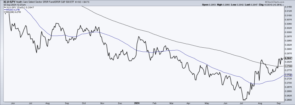
Over the years I have experienced a process whereby I take my own nominal charting (of stocks, sectors, or markets) less seriously, and their inclusion in a larger analytical framework more seriously. That includes the above-noted macro-fundamental and sentiment considerations, along with charts showing market internals (as an example, the currently buoyant XLV (defensive sector)/SPY (broad market) ratio, which, historically, has significantly raised the risk of oncoming bear markets when rallying. So okay, this chart tells us that the Healthcare sector (XLV) has been rising vs. the broad SPX (SPY) since early July and is threatening to break its downtrend, which becomes more realistic the longer it holds and furthers the break above the downtrend 200-day moving average (black).
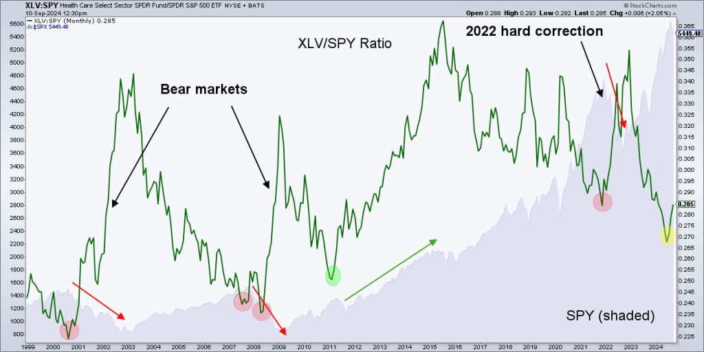
 A longer-term chart of the ratio offers support to the probability that IF the rally in the ratio above continues, it raises the likelihood of an oncoming bear market. The ratio pegged the bear in 2000, 2008, and 2021. It failed to do so in 2011 because, in my opinion, there was a lot of political noise in the macro surrounding Healthcare (a prime example of why macro matters) back then. But 3 out of 4? Those are not bad odds and when discussing TA or market management in general, we are talking “probabilities”, not predictions or robo-thinking.
 I could go on and on, because TA was my first market love. But having grown up now, market-wise, I am far more interested in nerding out on the whole ball of wax, inter-market relationships (ratio charts) and their implications on the macro, sentiment and best of all, opportunities to marry these other disciplines to the nominal charts I love so much. When talking “probabilities”, it’s always a good thing to have confluence of indications from several different angles pointing to a common outcome.
It’s all about probabilities, folks. But stand-alone nominal TA and its trend lines, patterns and death/golden crosses is not going to effectively cut it. Especially with a world full of TA jockeys out there doing exactly that.
Read the full article here


Leave a Reply