First, this tease: the last time the S&P 500 reached (by our quant-crunching) such current duration of being extremely “textbook overbought”, the mighty Index fell …(drumroll)… -26%. More on that later.
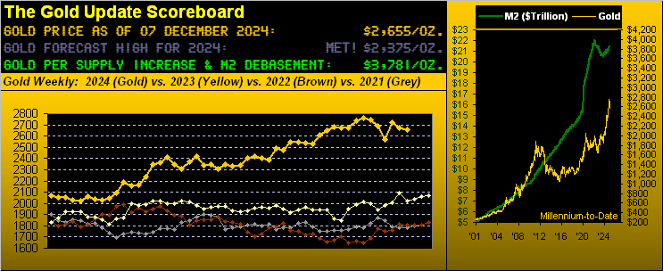
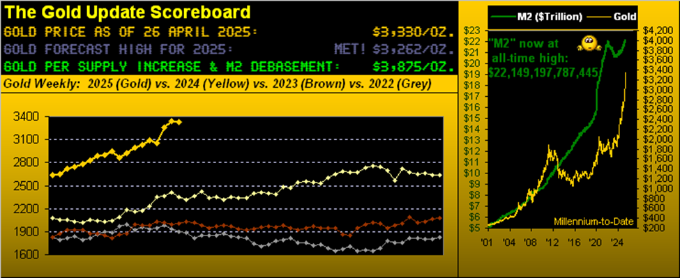
To Gold: on the heels of last week’s brief missive, here we go as promised with what otherwise would normally be our “month-end “graphics-rich edition, in this case right up-to-date through yesterday, 06 December. And as entitled “Gold Boring”, clearly for price ’twas a snoozer of a week, the -1.7% high-to-low range ranking fourth narrowest year-to-date toward our yellow metal settling yesterday (Friday) at 2655 in recording its fifth weekly loss in the last six.
Regardless, it now being a week past November’s month-end and with just four editions of The Gold Update remaining in 2024, let’s straightaway go to our BEGOS Markets’ Standings since New Year. And as was the case at October’s end, the precious metals remain upon the top two steps of the podium followed by the zany, earnings-lacking, non-monetarily-supported S&P 500 in third place. Too, from the “Gold Plays No Currency Favourites Dept.”, note the Dollar Index is nearly +5% year-to-date, with Sweet Sister Silver still leading the percentages pack:

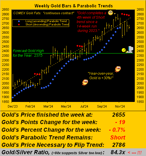
But in turning to Gold’s weekly bars from a year ago-to-date, the present red-dotted parabolic Short trend has completed a fourth week in duration, something that has not occurred since the 14-week run of being Short back in 2023 from that year’s weeks ending 26 May through 25 August. And per the graphic’s lower panel, to nix a fifth week of Short trend, price need trade up through 2786, (which is just -16 points shy of Gold’s 2802 All-Time High recorded this past 30 October). Strictly by Gold’s expected weekly trading range of 88 points, 2786 at least imminently is “out of range”. Either way, this year-over-year image remains fabulous, the yellow metal up +30%:
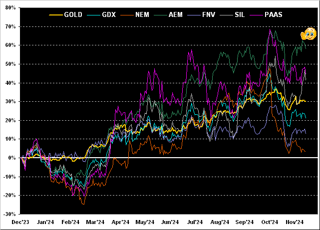
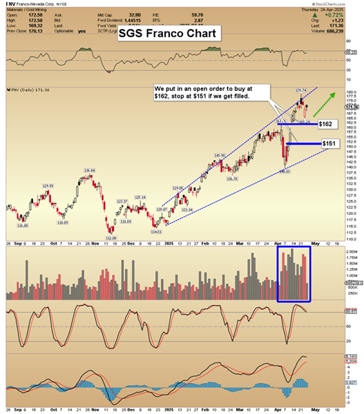
Now as would normally be our month-end wont, along with Gold’s +30% year-over-year gain, let’s next see how it compares with the performance tracks of highly visible precious metals’ equites. Thus from worst-to-first we’ve Newmont (NEM) +4%, Franco-Nevada (FNV) +13%, the VanEck Vectors Gold Miners exchange-traded fund (GDX) +21%, Gold itself as noted +30%, the Global X Silver Miners exchange-traded fund (SIL) +41%, Pan American Silver (PAAS) +45%, and topping the list Agnico Eagle Mines (AEM) +58%. On three (one, two, three): “Way to go, Agnico!”
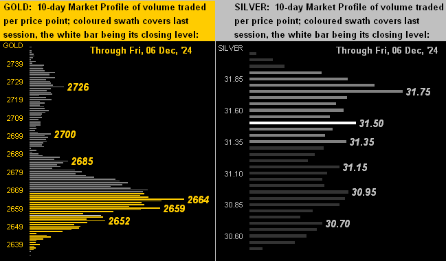
Next we drill down into the 10-day Market Profiles for Gold on the left and for Silver on the right. And per prices’ present positioning, we can see that Silver has been fairing a bit better. Two weeks ago, the Gold/Silver ratio was 86.6x, having since been reduced to now 84.3x, substantiated by Silver having increased across said stint by +2.0% whereas Gold has slipped -0.6%. ‘Course, it remains that Gold relative to Dollar debasement is very cheap and in turn, relative to Gold, Silver is super cheap. That noted, here’s the rather congested (certainly for Silver) current view:
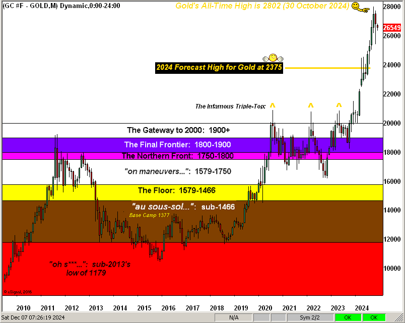
As to Gold more broadly, here’s our updated depiction of Gold’s layered structure across the past 15 years, the rightmost monthly bar being December’s initial week. Our forecast high for this year — couched last New Year as “conservative” — was for a run from year-end 2023’s settle at 2072 to 2375; instead, Gold went well on to reach an All-Time High at 2802.
“Well, you were right until it passed 2375, mmb…”
Thanks, Squire: we’ll take all the shameless plugs we can get, (courtesy of the “We Love It When We’re Wrong Dept.”) Here’s the graphic.
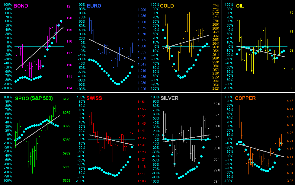
Now as we glide toward our opening S&P tease — indeed a true scare for the unaware — let’s next go ’round the horn for all eight BEGOS Markets during the past 21 trading days (one month) along with each component’s grey diagonal regression trendline and “Baby Blues” which depict the day-to-day consistency of trend. Obviously the best of the bunch has been the Bond, (for which in our 20 November Prescient Commentary we penned “…The Bond’s ‘Baby Blues’ [see Market Trends] have … moved above their key -80% axis: thus we look to still higher Bond prices near-term…” Notably, the trend of the S&P 500, too, is on the rise, albeit therein the “Baby Blues” are faltering. Here’s the whole gang:
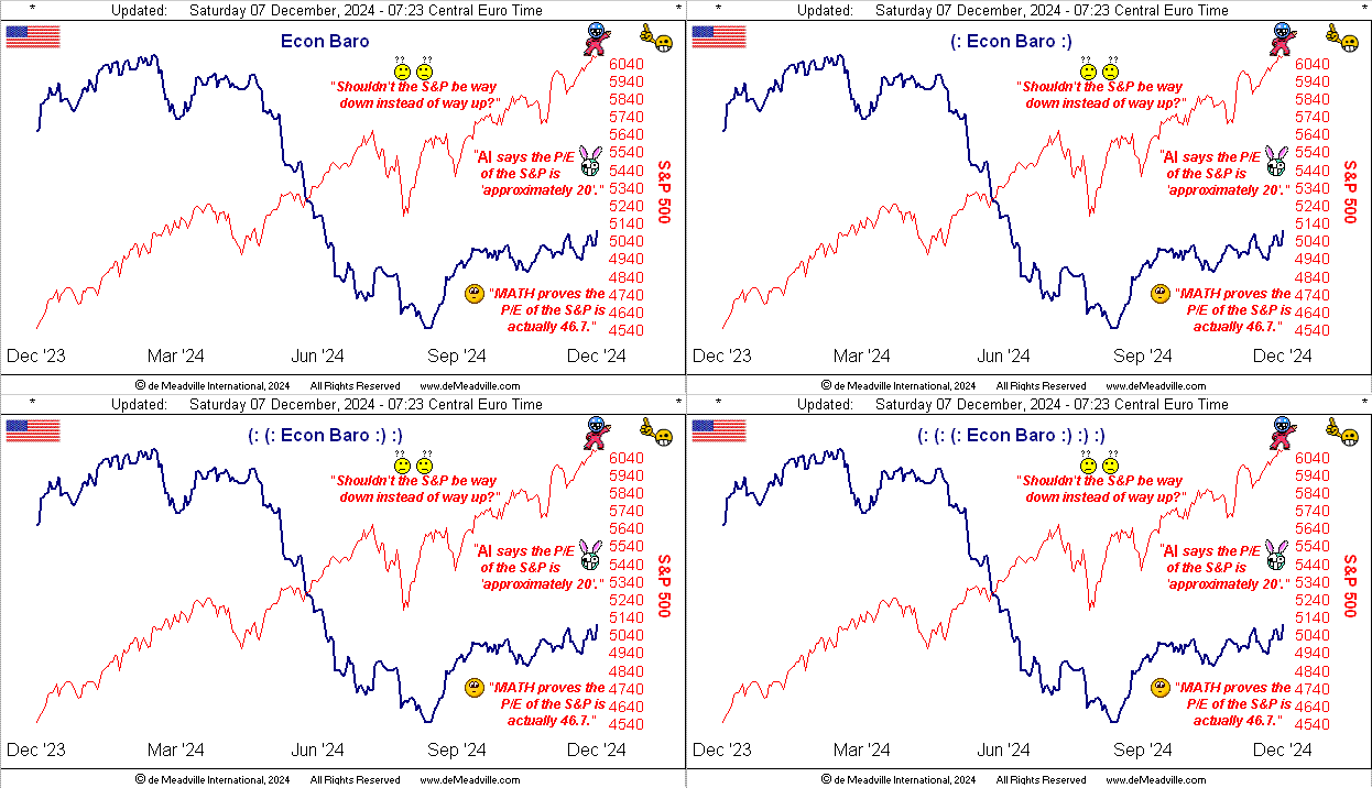
And so to the entitled “S&P Warning” we go. As graphically follows, the S&P 500 is the red line along with the Economic Barometer from one year-ago-to-date. Like you veteran readers and website devotees know, from its inception back in 1998 up to COVID in 2020, the Econ Baro would broadly lead the direction of the S&P. ‘Course upon COVID and the subsequent mass printing of more money, such leading phenomenon has since ceased. For with the +44% in additional Dollars swiftly injected into the StateSide liquid financial system came the like $7 Trillion increase to the market capitalization of the S&P 500, such that ’tis become impossible for it to go down, let alone materially despite the Baro having fallen through much of the year:
“But mmb, you said at the beginning something about a 26% fall in the S&P…”
So here’s the skinny, Squire.
Going away back to the days of AvidTrader (and indeed by this measure since the year 1980), when the S&P 500 gets a bit far afield from itself — either up or down — we quantitatively couch it as mildly, moderately or extremely “textbook overbought” or “textbook oversold”.
Through yesterday’s (Friday’s) S&P 500 settle at 6090, ’twas the eighth consecutive day of being extremely “textbook overbought”. And across the past 45 calendar years, on a mutually-exclusive basis, such eight-day run has only occurred 14 other times. Doesn’t sound like much right?
But wait, there’s more: the last time this current condition came to fruition was in November 2021 from which the S&P’s fall within one year was -26%, (inclusive of recession fears — and the Econ Baro today is significantly lower than ’twas then). The prior occurrence came in 2019 from which the fall within one year was -25%, (inclusive of the 2020 COVID mini-crash).
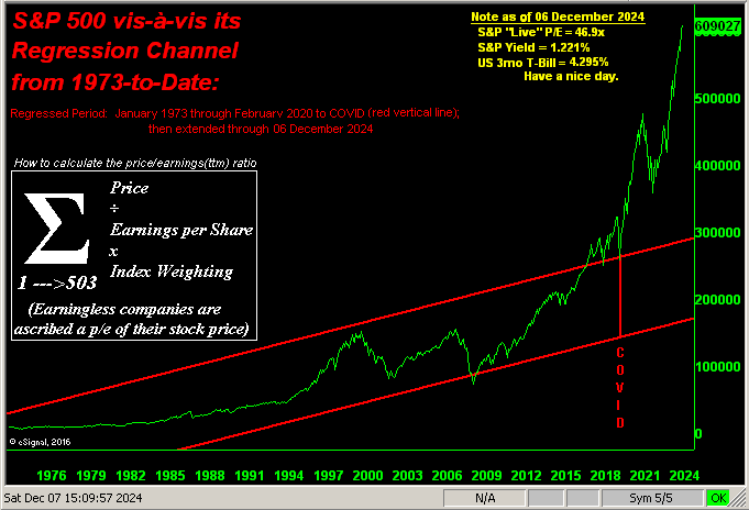
And yet the inevitable next time ’round, a like percentage drop might actually be considered small. Why? Don’t forget: had COVID never happened, the S&P today would at best be around 3000 and all would be as happy as clams. Instead, today ’tis at 6000 with the honestly-calculated price/earnings ratio now 46.9x, which is double the norm, and triple what was taught as “acceptable” in B-school. For you WestPalmBeachers down there, that means company earnings haven’t increased commensurate with stocks prices. To wit we update this closing graphic of the S&P 500 across the past 50 years with the extrapolated regression channel had COVID never happened. Fortunately however, earnings are no longer meaningful for stocks’ pricing:
‘Course, your “expert” all-in equites money manager has the appropriate protection in place, right? (Pssst … and given the current $53T market cap of the S&P is supported by a liquid U.S. money supply of “only” $22T, broker-issued IOUs will be made available, right?)
“Got Gold?”
Cheers!
…m…
www.TheGoldUpdate.com
www.deMeadville.com
and now on “X”: @deMeadvillePro
Read the full article here





Leave a Reply